Saturday, February 27, 2016

The Water

So I have been making waves (literally -- figuratively? Visually). I decided to use couching for the infill of the water, mostly because the directionality and undulation of each wave can be conveyed using this stitch, but also because each stitch should catch the light and one can see the glint and glitter of these myriad pinnacles aglow -- much like the refracted patterning that freckles the surface of the water. Moreover, this stitch provides the smoothest blending of shades, which helps to create flow.

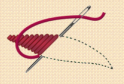
First I connected each of my waves using a slightly lighter shade of blue. This allowed me to define the contours of each wave, providing a trajectory for the ensuing rows. Gradually, I filled in the gradients of each wave from the top. from the top. Next I added a dash of white to form the reflection of the moon (whose symbolism during the Elizabethan era I will get into later) I intend to work up in the corner of the piece. Next -- more couching.


Unsurprisingly, I found out that this is a technique that has not ultimately been preferred by 16th  and 17th century ladies for reasons relating to time and effort. By far and away, this is the easiest stitch to lay -- but it is the greatest of tediums to fill in large swaths of fabric. As textile curator George Wingfield Digby has noted in his discussion of Elizabethan embroidery, "the techniques which depend rather exclusively on the use of metal thread and couching are hard on the hands of the worker and uninviting to the amateur, who could always find much more agreeable forms of embroidery with which to be occupied" -- in fact, Digby even describes the way in which a minimal use of couching is often an indicator of domestic, as opposed to professional, embroidery (1963:34). I suppose that all sounds fairly reasonable -- if you're getting paid for your efforts, maybe you don't mind couching as much -- let's hope that you're being paid by the hour. Perhaps this speaks to my level of boredom (or my proficiency at this stitch and this stitch only).

Finally, my curiosity got the better of me. I wanted to try a new stitch, so I raced ahead of myself (there's plenty of time to finish couching in these waves yet!) and furnished one wave with a tuft of French knots. The outcome was rather pleasing  -- although I was unhappy with the shading from the bottom I had done, so I plucked that out (lesson learned -- let the bulk of the wave be teal and not blue) but kept the waves.


So. Couching. :/
 But French knots so yay! :D


Sources Cited

Digby, George Wingfield

1963 Elizabethan Embroidery. London, England: Faber and Faber Ltd.

Friday, February 19, 2016

The Experiment

Finally ready to begin sewing, I started with a satin stitch to create the waves in my design. In all of this, do bear in mind that everything I know about needlework I learned through a process of awkward fumbling, trial and error,  and of course, ripping out all my work and starting again. I have previously undertaken (what I consider to be) the dreaded satin stitch already -- I used it on my Regency era gown to create the rolling floral scrollwork on the sleeves. But to transfer that design, I had traced the pattern by stitching through paper, creating a well-defined border over which my perpendicular stitches would lay.

This time, I endeavoured to adhere to the technique depicted in stitch manuals, which all seem to display the needle pushing through the fabric alongside the previous stitch -- sans border.

Image courtesy of Ellen Mauhrer-Stroh.

Suffice it to say that I was displeased with the results. I had tried to use the area covered in the ink as my marker, but the stitches refused to lay in alignment, giving the form a serrated edge, and I was giving myself eyestrain by peering too closely at the fabric in order to strike my mark. Every pass was a struggle of readjusting my needle five, six, seven times before finally pulling the needle through and laying another stitch. On top of that, the amount of void fabric wrinkling was outlandish!

 I finished two waves in this style, and when I had finished, I anguished. 'This looks terrible!' I thought, so I tried to see if its appearance could be improved by laying a row of couching along the edge to cover up my irregularities. The work saw marginal aesthetic gains.

 The top two waves in the right hand corner (note the one that is underlined in a lighter shade of blue) were executed without a running stitch border.

So I reverted to my previous method of laying a foundation of running stitch before executing satin stitch, and saw vast improvements to the work. Not only did it allow me to work at lower light levels and reduce the amount of hard squinting I had to do in order to hit my mark, but it also gave the forms an added height, giving the lines a raised appearance. On top of that, it immensely reduced the amount of void fabric wrinkling and expedited every pass of the needle.

A comparison of the two forms as seen from the back side. Note the greater degree of evenness and regularity for each perpendicular pass of the needle.

Being a perfectionist, I considered destroying the evidence -- ripping out those waves which displeased me, and covering up my mess with new stitches. But I remembered one of the lessons that needlework teaches us, a lesson espoused by my teacher Peter Morin in the indigenous studio arts class I had previously taken with him. In his discussion of indigenous pedagogies, he talked about the way in which we learn from the actions we take in our labours, but in needlework (beadwork, in that particular context) especially, we leave a record of our actions, and so our mistakes become valuable to others. Thus, we come to learn from our own work, as well as those works made by the efforts of another. I kept the stitches, since they are inscribed with a record of their own creation, and as such, these so called "mistakes" become valuable.

Thursday, February 18, 2016

The Reading of Textiles

Logically, after I finished rendering the design, I applied my interface and stretched my fabric over the hoop. Strangely enough, this is the first time I have ever made use of an interface in my embroidery (standard practice for the modern embroiderer working in thread instead of floss) to reduce void fabric wrinkling. There are few indications that 16th and 17th century embroiderers employed an interface for such works, but that is precisely is why it's such a tremendous shame that few discussions and depictions of historical textiles make close examination of the back side -- and this is why it is imperative to do so.


 By the way, this is what I mean by void fabric wrinkling.

Sure, the making of a broidery is a record of its manufacture -- a skilled needleworker can read the stitches etched onto the surface of the fabric like a message. Here, the haptic sense is virtually as important as the visual faculties.  For example, take the box panel (dated between 1650 and 1675) I mentioned in the last post. (My apologies for the resolution and formatting, although we need to blow this bad boy up in order to get into the nitty gritty!)


We can see in the fabrics of the woman's dress and scarf a preference for surface couching along a colour gradient for shading -- note the vertical alignment of stitches in the skirt folds, and the undulating shades of the scarf following the curvature of the object. This creates a very pleasant flow to these garments, so the directionality of the stitches is clearly an important aspect for creating this effect.


But we see another choice for gradient and shadow -- short and long stitch. This can be seen in the contours of the grassy knoll the figures are set upon, and the limbs and faces of the ewe and her lamb. Note the staggered lines marking each shade, so stitches no longer lay parallel to one another, but instead have the appearance of biting into another colour.


We see outlining is done in a couple of ways, as well. It appears as though the contours of the hat and the bottom edge of the church are rendered in stem stitch -- it's difficult to see precisely, but it seems likely, given the unbroken lines used here to define the borders of these features.


But when we examine the contours of the clouds, we do see an interrupted line. I would venture a guess that this was achieved using a back stitch instead of a running stitch, but since I am deprived a closer look of the back side, it can't be said for certain.


Added texture is also seen here in the french knots worked to create the woollen coat of the little lamb. How cute!


The physical description of the object provided by the Victoria and Albert Museum suggests that this item was worked on satin with silk threads. With regards to the aforementioned stitches, I am in complete agreement. But this description does not seem to account for the added texture of the thicker cordage used to work the floral embellishments of this piece.


I mean, come on -- it's raised, it's thick, it's plush; it's definitely not silk. So what is it? My best guess, given the box panel's location of origin (Great Britain, possibly England) is that it's probably wool. Swain describes in her book Historical Needlework the changing fashions of embroidery in late 17th century England, explaining that "Silks were expensive, and in the war-torn years of that period were often difficult to import. Instead, a material of linen and cotton with a twill weave was [commonly] used, decorated in a variety of stitches with bold leafy designs in coloured worsteds" (1970: 32). She goes on to describe how:


Wool embroidery on linen was not, of course, an innovation. The embroidery on that long strip that we call the Bayeux tapestry is embroidered in wools on a linen background. Silks for needlework were always expensive, since they had to be imported from Mediterranean countries (Swain 1970: 33).


Brief aside: if you study historical embroidery at all, you will hear a lot of reference to the infamous Bayeux tapestry. Like, endless discussion of it. Pictured below, some humorous memes regarding the Bayeux tapestry, just for funsies:


But back to locally produced goods. Of the fibres that can be produced with relative ease in the clime of Western Europe, the choices are few: largely limited to wool and flax. But why embroider a linen (made of the woven fibres derived from flax) field with woollen fibres, why not produce a denser matrix to be worked over with a finer thread (which would almost certainly limit or reduce the void fabric wrinkling in the piece)? Because, according to Swain, "wool accepts dyestuffs more readily than flax, and will dye to more brilliant shades" (1970:33).


Regardless of whether or not we're talking about a work completed in the 11th century or the 17th century, we still get very little discussion of the back side of works, and the issue of whether or not an interface material was used remains a mystery (I suspect not, if no one has mentioned it, but I suppose a good scholar doesn't bank on a maybe like that). It really goes to show how important it is to really handle the piece in question, since texts and images are clearly coloured by the focus of the researcher who documented the object.


Sources Cited

Swain, Mary

1970 Historical Needlework: A Study of Influences in Scotland and Northern England. London, England: Baryy and Jenkins Ltd.

Tuesday, February 16, 2016

The Design

So the first thing I did was apply the design by drawing it out freehand. I used a water soluble fabric pen, a standard tool in the kit of the modern seamstress, but the first thing I noticed about this technique is that the ink tends to bleed. A lot.

It's funny, because in order to complete previous works, I had simply printed out the design and sewed a running back stitch through the paper until I had traced the image. Then I simply tore the remaining paper loose and worked on filling in the design. That's how I was able to achieve a high degree of symmetry on the Pictish wolves -- I drew my image based on documented archaeological finds (primarily stone carvings, since that is largely what remains of the Pictish culture group), scanned the image in, saved a copy in mirror image and printed out the final result for applique. For the task at hand, I knew that such a technique would be unhelpful, given the high degree of detail of Gessner's hippocamp. Moreover, I had foolishly assumed that paper would have been a costly commodity in the 16th and 17th centuries, and as a consequence, sewing through paper would have been ill-advised.

But draughting on paper would have been a necessity. Although the standard technique of the time did not adhere to the method outlined above, it appears as though patterns were transferred from paper (either from pattern books or draughted designs completed by an experienced amateur or professional draughtsman) through a process of 'pouncing': the pattern was pricked with a pin at regular intervals and applied to the fabric before it was rubbed over with charcoal (Victoria and Albert Museum), similar to the way in which painters such as Michelangelo applied designs drafted on paper to a wall or ceiling surface before painting a fresco (Grove Art Online). 

I was already aware that a number of pattern books were in circulation at this time, although acquiring access to a reproduction has presented some difficulty. Nonetheless, according to this fascinating article put out by the Victoria and Albert Museum:

By far the most common way of getting a design however, was through pattern books. The first recorded example was published by Johann Schonsperger in Germany in 1523 and others followed quickly throughout Europe, especially in France and Italy. Between 1523–1700 more than 150 separate titles were published. Although the high number of titles would seem to indicate a wide range of different patterns, plagiarism was rife and the same designs appear right across Europe over and over again; sometimes publishers would have new wood blocks cut with small embellishments but quite often they were a direct copy. In Britain, the output of pattern books was small and only four titles have been recorded. This was partly due to the paucity of good engravers but also publishing laws which meant only certain types of books could be published in quantities large enough to be financially viable.


 La Vera Perfettione del Designo by Giovanni Osatus.
Image courtesy of the Victoria and Albert Museum.

 Rather ingeniously, it appears as though many of the patterns disseminated through such means were printed on a grid, allowing the embroiderer to "increase the size of the finished embroidery by drawing out the designs using the same proportions but on a grander scale onto more squared paper, often provided by the publisher" (Victoria and Albert Museum). However, this was not the only means by which designs were derived: it has been suggested that the experienced needleworker could "move from embroidery books to patterns designed for bookbinders or calligraphers and for the really inventive, herbals and emblem books" (Victoria and Albert Museum). 

Design from Das Neue Modelbuch (1593).
Image courtesy of the Victoria and Albert Museum.

Troublingly, it has been difficult to attain a reproduction of these works. On the bright side, it appears as though the V&A -- which is quickly becoming a veritable repository of knowledge for me, since they appear to be one of the few institutions which prizes its textile art -- houses sixty original pattern books, including such notable works as Richard Shorleyker’s Schole house for the needle from 1632 (Victoria and Albert Museum). Now all I need is a one way ticket and a drizzly day in London to while away the afternoon, moldering in the archives!

But what happens after pouncing is complete? I suspect that after pouncing took place, the dots were connected by other means -- perhaps ink? As we can see from this late seventeenth century unfinished box panel, a high degree of compositional detail was recorded on the fabric prior to stitching -- in a much finer line than my fabric pen would allow!


Unknown artist, unfinished box panel worked on satin in silk thread (1650-1675). 
Image courtesy of the Victoria and Albert Museum

In some ways, I am grateful to have forged blithely ahead with the project in blissful ignorance of draughtsmanship and pouncing. Although the practice of embroidery may foster such virtuous qualities as patience, perseverance, diligence, and dedication (since meticulous stitching virtually necessitates such endowments), I doubt that I have the internal fortitude required to engage in this technique. Then again, this project already diverges from the historical context of production in a number of ways, and since I don't have access to the original text, I must make use of stock photo previews. Already, this is a reproduction of a reproduction, and several steps removed from the original. Nonetheless, I feel like my freehand transcription of the image is comely enough to continue.


Sources Cited

Oxford Art Online. "Pouncing." Accessed February 16, 2016.

Victoria and Albert Museum. "Embroidery Pattern Books 1523-1700." Accessed February 16, 2016. http://www.vam.ac.uk/content/articles/e/embroidery-pattern-books/


Saturday, February 13, 2016

The Goal

The project I intend to undertake is the creation of a personal impresa following the compositional aesthetics suitable to the Elizabethan era while employing the stitches in use at this time. The goal is to undertake this project while recording my hours (and the light levels at which I work) to calculate a rough cost in candle expenditure based on household expenditure record (nerd alert!). This is partially based on an interest in historical textile production more generally, but also a particular interest in the nature of time and its relationship to embroidery as a practice.

The object I plan to make is an ornamental throw pillow for the furnishment of my bed using an impresa of my creation. The personal emblem seems just the right motif for use on bed furnishings, given the fact that, historically, the bed has always been the most costly piece of household furniture (where beds were even available), and as historian Lucy Worsley has pointed out in her TV documentary series If Walls Could Talk and Tales from the Royal Bedchamber, it also set the stage for life's most important events: birth, death, marriage, and so on.


My bed is no exception (although, allow me to clearly underscore that I was not born in this bed!); it is a site where I spare no expense, preferring (wherever possible) to employ natural fibres, regardless of cost. For one thing, it is a king sized bed, which means that of course I cannot live without my four pillows, Egyptian cotton sheets, two goosedown duvets, and stuffed animal.

Last year, I spent several months crocheting a king sized throw out of 100% Peruvian highland sheep's wool -- let it be known that it cost me approximately $280 CAN to purchase sufficient quantities of fibre! Additionally, I recently undertook my very first ever upholstering project (yelp!) in order to to achieve a more harmonious aesthetic, so I covered up my gaudy second-hand headboard with a more opulent looking discount upholstery fabric. Clearly, the bed is the kind of furniture in which one (and myself especially) invests quite heavily.


You may be wondering what an impresa is. An impresa  can be considered someting like a maker's mark, or a pictorial signature, using combinations of text and imagery -- often imagery which is drawn from the natural world, such as plants, animals, and inanimate objects, etc. Unlike other forms of heraldry, which are often hereditary, personal ciphers were selected or constructed by the individual using symbols representative of the self.


On the emblems from which many impresas were drawn, textile historian Margaret Swain writes:


[the interest in] emblems, those pictures with a Latin motto offering a moral thought or contemplation, is today almost incomprehensible to us, even with an English translation of the motto. In the seventeenth century, emblems and emblem books, from which some these designs originate, were a part of the educated man's or woman's intellectual equipment. They were recognized and solved, just as some today enjoy solving the recondite clues of crossword puzzles (1970: 20).

Hence why these emblems were also known as ciphers, since the iconography of these compositions reflect a careful coding of personal and cultural values. For example, Venetian painter Titian took the she-bear licking her cub into shape with the motto  natura potentia ars (art more powerful than nature) for his impresa (Fortini Brown 1997:62). This is a depictive reference to the poetry of Virgil, in whose work can be found a simile describing the way in which the cub is born without form and must be licked into shape by its mother (Fortini Brown 1997). The imagery functioned as an allegory for the way in which Titian himself gave shape to something greater than the raw materials provided by nature (Fortini Brown 1997). Access, albeit limited, to a version of Titian's impresa can be found here.

Another example is the cipher of Mary Queen of Scots, as well as that of her mother Mary of Guise. Mary's cipher appears on her signet ring, her book stamp, a cushion housed at Hardwick Hall, and on "several of the applique panels of green velvet of Oxburgh Hall, Norfolk" (Swain 1970:20), aka. the Oxburgh hangings. It consists of the overlaid Greek letter Φ (a reference to her first husband Francis II), and the letters MA (Swain 1970). One of the Oxburgh panels depicts this monogram topped by a crown and "flanked by thistles, surrounded by her motto-anagram: 'SA VERTU M'ATIRE'" (its strength draws me) (Swain 1970: 20), meaning "Its strength draws me." Curiously, it seems as though Mary worked variations of her cipher; some contained this motto-anagram, while others employed the pictorial imagery of a lodestone turning towards the pole in conjunction with this motto (Digby 1963).


Mary's impresa as seen on the Oxburgh Hangings. Canvas applique in silk and gilt thread using tent and satin stitch, applied on a green velvet ground. Dated to 1570.
Image courtesy of Marie-Stuart.co.uk
 and reproduced from the book by Margaret Swain.

Mary's mother adopted the phoenix with the phrase en ma fin git est ma commencement  (in my end is my beginning) as her personal device (Swain 1970). It has been suggested that this is a reference to the process of forging a new life after the loss of not one but two husbands (Swain 1970). 


A phoenix on the Oxburgh Hangings enclosed in a cruciform using canvas applique, silk and gilt thread in tent stitch, applied to green velvet. Dated to 1570.
Image courtesy of Marie-Stuart.co.uk
 and reproduced from the book by Margaret Swain.

 So the function of the impresa  appears to be two-fold: for one, it communicates something about the self to others, who must draw upon cultural, visual, literary, and religious references (as well as their personal knowledge of that person) in order to cipher its meaning. Additionally, it also seems to be an affirmation of the self and a personal ethos, a guiding principle, and a prescription of how to act and think.


Being a person who already subscribes to belief in animal signifiers, I have taken as my personal motif the hippocamp (water horse).  When my horse Bailey (pictured here, splashing in sheer delight) died in 2008, I memorialized her in a tattoo I designed based on this Celtic knot. Since I have been riding horses from the age of six, and am a Pisces  by birth as well as a fifth generation inhabitant of an island city, the hippocamp seemed a natural fit.

Swain has described the way in which impresa design is "intensely personal," and the way in which many designs depicting creatures from the natural world "were taken from Historiae Animalium published by C. Gessner in 1551, whose half-mythical animals served as pattern sources to decorators as well as needlewomen" (1970:20). For this reason, I have elected to do the same.


Hippocamp, as depicted in Conrad Gessner's book

The design will be executed in my hereditary colours of blue and gold (drawn from my patrilineal descent). Luckily, I am spared from rendering the myriad complexity of Celtic knotwork! Even still, I have my work cut out for me (no pun intended). Fun fact: Mary herself even worked a seahorse based on this illustration, and it can be seen in the Oxburgh hangings housed at the Victoria and Albert Museum today.


One half of a cruciform applique panel worked on canvas with silk and gilt thread using tent and satin stitch. Dated between 1570 and 1585.
Image courtesy of the The Victoria and Albert Museum.


Sources Cited

Digby, George Wingfield
1963 Elizabethan Embroidery. London, England: Faber and Faber.

Fortini Brown, Patricia

1997 Art and Life in Renaissance Venice. London, England: Lawrence King Publishing Ltd. 

Swain, Margaret

1970 Historical Needlework: A Study of Influences in Scotland and Northern England. London, England: Barrie and Jenkins Ltd.

Friday, February 12, 2016

The Girl

My name is Lannie and I'm in the final year of my undergrad, majoring in Anthropology with a minor in Art History. My first attempt at sewing was in the sixth grade, after I got fed up with stapling the pocket of my private school trousers shut (but mostly because the staples kept scratching my leg). Needless to say, it was an ugly gnarled mass of stitches, but it got the job done.

Since then, my skills developed gradually in fits and bursts of needlework here and there. When I was nineteen, I sewed band patches onto my army jacket in a fit of teenage angst, and only came to realize later how this act of ornamentation functioned as a public declaration of my identity as configured  through an iconography of punk and death metal.

Two years ago, I helped work on the World's Largest Button Blanket under the auspices of Tahltan artist Peter Morin and West Coast art historian Carolyn Butler Palmer.

Photo by Margeory Graham.

The blanket was danced at the Diversity Conference held in First People's House at the University of Victoria, and in order  to mark the occasion, I worked diligently in my spare time to embroider my own ceremonial regalia using the symbols appropriate to my own cultural background.


 Since my ethnic background is comprised of virtually all the Celtic nations (except England proper), all the Nordic nations (with the exception of Finland), with some Saami and German mixed in, I embroidered a vest depicting the Pictish wolf in my matrilineal family colours of red and white.


For extra credit, I helped to sew one of several button blankets which would ceremonially veil the works of Emily Carr in a reclamation of coastal iconography. These blankets were later gifted to honoured guests at the performance art demonstration held at the Legacy Art Gallery and enacted by Peter Morin and Rebecca Gilmore.


After these formative events, I was hooked (pardon the mixed metaphors). Shortly thereafter, I was hunting down Regency era patterns to embroider on the sleeves of a gown fashioned after the style of that period. And recently, I had my 1891 Singer treadle sewing machine serviced, so it is ready for action!